Customising PowerPoint 2016 Backstage View
Microsoft Office Extensibility with Fluent UI XML programmingWhat is the Backstage View?
 The Backstage view in any Microsoft Office application is the view you see when clicking the File button in the ribbon. It presents information about the current file, the interface to open files, create new files and export files in additional to other functionality.
Like the ribbon, the Backstage view is customisable and extensible via the use of the XML customUI element which may reside in a presentation, spreadsheet or document file, or an add-in.
In this article we’re focussing on how to customise the PowerPoint Backstage view, and more specifically, the 2016 version. Since the Backstage view was first made available in Office 2010, new features have been released which have extended the Backstage view functionality.
Finally, it’s worth mentioning that thanks to Office 365 subscriptions, PowerPoint (and all Office apps) are constantly evolving, mostly for the better. This article was created using the PC version of PowerPoint 2016 Insider, version 1802 (Build 9026.2006). What you see may or may not be exactly the same! Mac users can go grab a coffee because there is no Backstage view in PowerPoint:mac 2016.
Fluent UI Entry Point
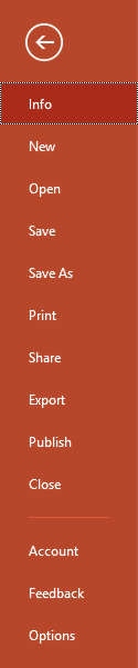
When you click on the File tab in PowerPoint 2016, you see this tab structure on the left hand side of the window.
Each one of the items is either a tab control or a button control. When customising the Backstage view, the first thing you need to know is the unique names of these controls, or their idMSO names.
| UI Text | Control Type | Control idMSO |
| Info | Tab | TabInfo |
| New | Tab | TabOfficeStart |
| Open | Tab | TabRecent |
| Save | Button | FileSave |
| Save As | Tab | TabSave |
| Tab | TabPrint | |
| Share | Tab* or Button* | TabShare* or ShareDocument* |
| Export | Tab | TabPublish |
| Publish* | Tab | Publish2Tab |
| Close | Button | FileClose |
| Account | Tab | TabHelp |
| Feedback* | Tab | TabOfficeFeedback |
| Options | Button | ApplicationOptionsDialog |
* Depending on the Office 365 build
What types and level of customisation is possible?
There are three main types of customisation that you can design:
- Manipulating built-in Backstage view functionality.
- Examples: hiding the Share tab or repurposing the Save button.
- Adding your new functionality as a new tab.
- Example: creating a new tab “My Stuff” with your own set of controls.
- Integrating your new functionality into an existing built-in tab.
- Example: adding a new export file format to the built-in Export tab.
What is not possible?
I addition to understanding what can be done, it’s equally important to have a feel for what can’t be done. Programming the Backstage view is complex and there are a lot of rules but these are the common restrictions you may come across:
- It’s not possible to define the visual style of elements. They are fixed by Microsoft.
- Example: If you want to use the orange heading text, this style is automatically applied to category controls but category controls cannot be placed anywhere you like.
- Somewhat like the ribbon, you cannot modify certain built-in controls.
- Example: You cannot insert your own controls below the “Info” title of the Info tab.
Editing the CustomUI XML
Since the fluent UI model was first introduced, new tools have been introduced to make UI customisation development easier. These includes Microsoft’s own Ribbon Designer in Visual Studio, the RibbonCreator app from Gunter Avenius, RibbonCustomizer, RibbonX Visual Designer and others.
The problem is that [at the time of writing this article] none of these applications have a WYSIWYG interface for developing the Backstage view. And that’s is what makes developing apps that integrate into the Backstage view so challenging.
So, the solution we’re using here is the free Custom UI Editor which is pretty basic but will allow you to create colour-coded XML markup, validate it, insert UI images and generate callback signatures. It does have an annoying scroll bug but it’s still a very capable and usable tool. You could of course use any text editor to create a customui.xml file and save it into your Open XML ZIP archive but that’s not covered here.
Important note:
If you have other customisations in your XML code, such as a <ribbon> element, make sure the <backstage> element is placed after this because it won’t work if it’s placed before it.
Customisation Example 1
Based on what we’ve learned so far, let’s start with a simple example. The following XML will disable the Share tab:
Or for newer builds of PowerPoint 2016:
This is an excellent example to demonstrate the ‘moving target’ challenge we mentioned earlier on in the introduction. At some point in the Office 365 roadmap the Share tab has been replaced with a Share button. You can’t actually tell what is a tab and what is a button just by looking at the Backstage view UI. Not until you click the tab or button does it become apparent. If the Backstage view remains in view, you clicked a tab and if it disappears from view, you clicked a button.
In our example, we can cover all builds of PowerPoint and hide the Share tab or button for good (unless Microsoft introduce a new control for Share with a new idMSO!) by doing this:
Customisation Example 2
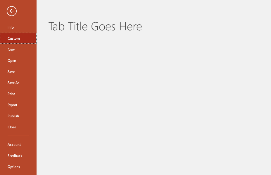
In this next example, we’re adding a new custom tab and placing it in-between the Info and New tabs.
This renders a new Custom tab with a title:
That’s all very good but we need to create some content in this tab. Before we do that, let’s explore the different types of structure for content within backstage tabs.
Backstage Tab Content Structure
Unlike the ribbon, there is more you can do with laying out content in Backstage tabs. You can create controls, tasks, groups of tasks, each task having its own group of controls and layout containers.
At the top level of the structure, the right hand side of the screen is divided into two columns as follows:
Note a subtle difference in the code above in that the opening of the element <tab> is not closed by the “/” suffix but by the </tab> at the end of the snippet. If you’re used to writing XML, this is obvious but not so for others.
If this your own custom tab, you can specify the widths of the first or second column, but not within the firstColumn or secondColumn elements as they have no attributes. This is specified in the parent node i.e. the <tab> element using the required combination of these attributes, each of which is a positive integer percentage between 1 and 99:
Within each column, we can insert various types of groups. There are three group types as follows:
- group : a group of one or more controls, including button, checkBox, comboBox, dropdown, editBox etc.
- taskGroup : a group of one or more tasks. A task is in itself a group of controls.
- taskFormGroup : a group of tasks, each one of which has an associated second column, which is a group of controls.
This is easier to visualise with some examples:
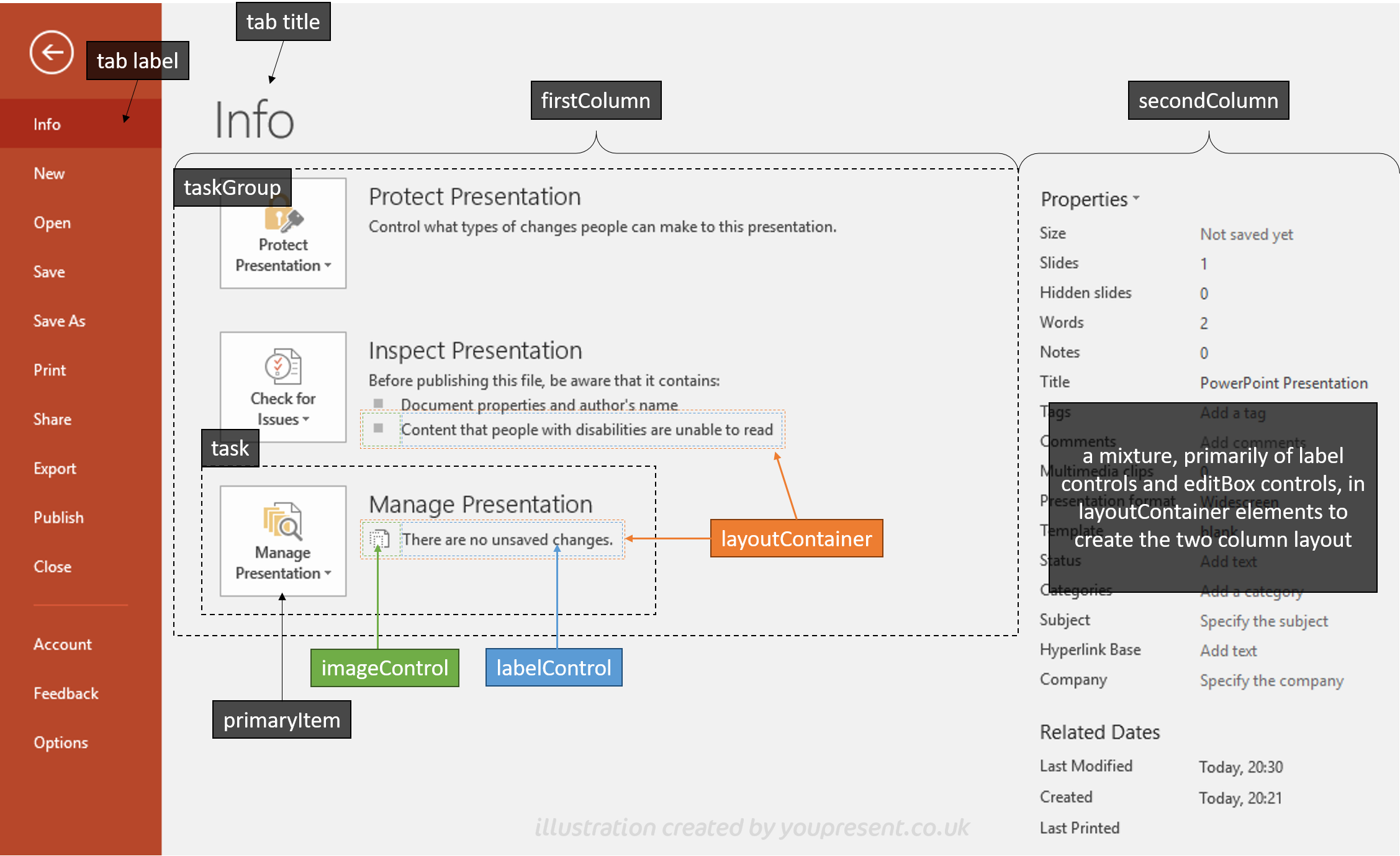
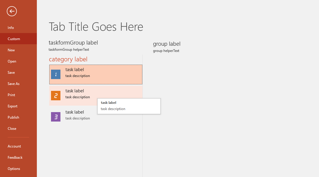
In the Info tab example above, the first column and second column are fixed. That is to say that regardless of what task is clicked in the left column, the content of the right column remains the same.
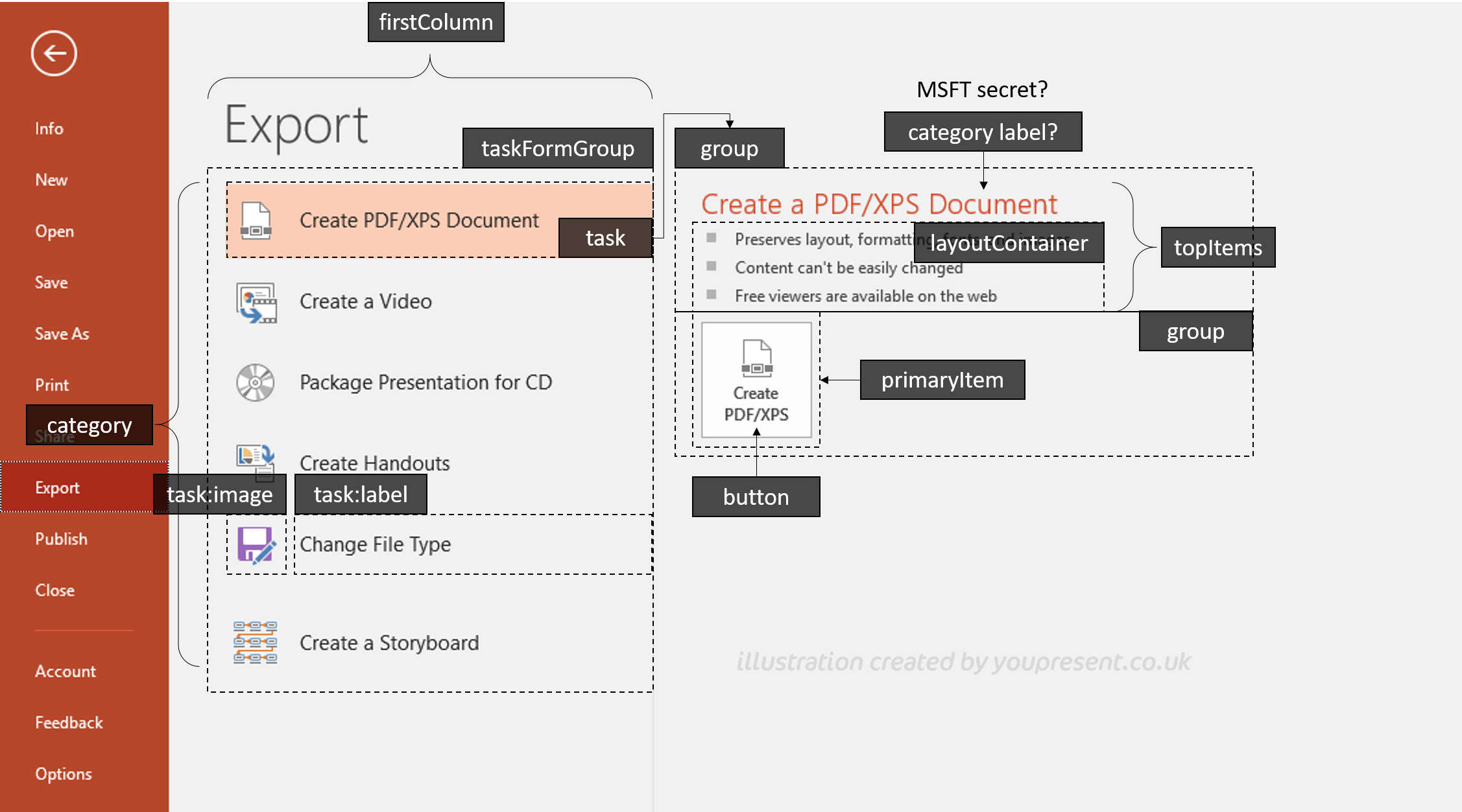
Contrary to the Info tab structure, the Export tab is built using the taskFormGroup control. This group of tasks is placed in the firstColumn and for each task in the group, there is a corresponding group which is presented in the second column automatically, without having to specify a secondColumn element. When each task in the first column is clicked, the content in the second column changes to the group specified by that task. Note that if you were to specify a secondColumn in this example, you would actually get a third column because a task’s group container does not actually get rendered in the second column but a sub-column of the first that contains the taskFormGroup.
The callout “MSFT secret?” is a mystery. The only control which is rendered with orange text is the label attribute of the category element. But a category element is a child of either a taskGroup or a taskFormGroup, both of which are only permitted in the firstColumn and secondColumn elements. So it looks like Microsoft may have tweaked their rendering engine to allow this style in the group element of a taskFormGroup task.
Back to Customisation Example 2
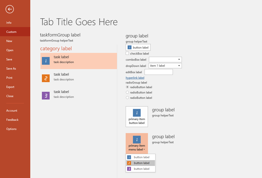
Now we have some knowledge about how columns, groups of tasks and groups are structured, we can start to build the content for our custom tab. Below is a framework for our taskFormGroup with three tasks. Note that you may not want to use all of the label and helperText attributes but they’re included so that you can see how they are rendered.
The corresponding XML for the above structure is as follows:
Note a useful attribute for the taskFormGroup here is allowedTaskSizes which specifies how large to task box and associated icons are. We’ve used medium here, to specify a 32x32px icon but you can also use small and large for 16x16 and 64x64 sizes respectively.
Let’s now put some active controls in the task’s group over on the right hand side. Active controls are those which the user interacts with and support callbacks for actions. For the Backstage view, the full list is very similar to that for the ribbon:
- button
- checkbox
- comboBox
- dropDown
- editBox
- hyperlink
- menu
- radioGroup containing one or more radioButton controls
There are a couple of controls that ribbon designers may not be familiar with and these or the radioButton and hyperlink controls.
The corresponding XML for the above content is as follows:
Note that a group element starts of by containing one of these mutually exclusive container types:
- primaryItem
- topItems
- bottomItems
When content is defined as being the primaryItem, it is automatically styled to give it more prominence in the view. So whilst the code for the button at the top of the view is the same as that for the button in the primaryItem element, the latter is given more emphasis.
Primary item buttons often have the isDefinitive attribute set to true. This causes the Backstage view to close when the button is pressed, indicating that the feature no longer requires the Backstage view to be active, perhaps because it’s opening a new UI window or that this was the final action in the workflow.
For the topItems and bottomItems elements, there [currently] appears to be no difference in the way they are styled in the Backstage view. This may or may not change in the future. For now, there appears to be no reason to use the bottomItems element.
Now that we’ve looked at the main structural layout elements, there are a few more controls left to mention as follows:
- groupBox – creates a group of controls
- layoutContainer – creates invisible tables of content in vertical or horizontal directions.
- imageControl – places an image in the content and used to create bulleted items.
- labelControl – places plain text in the content.
Callbacks
Once you’ve created the layout design of the controls, you’ll need to add some code to your project. This might be VBA, .Net or C. To keep things simple, we’re going to use VBA. The callback signatures can be automatically generated if you’re using the Custom UI Editor app as follows:
Once you have these callback procedures set up in your project, you manage the flow of user actions to and from the Backstage view controls. Since this article is focussed more on the visual design aspects of the Backstage view, we’re not going to cover the code in more detail.
Customisation Example 3
In this last example, we’re going to show you an actual product solution that incorporates its functionality into one of the existing built-in tabs of the Backstage view.
[coming soon – awaiting client launch in March/April 2018]
References
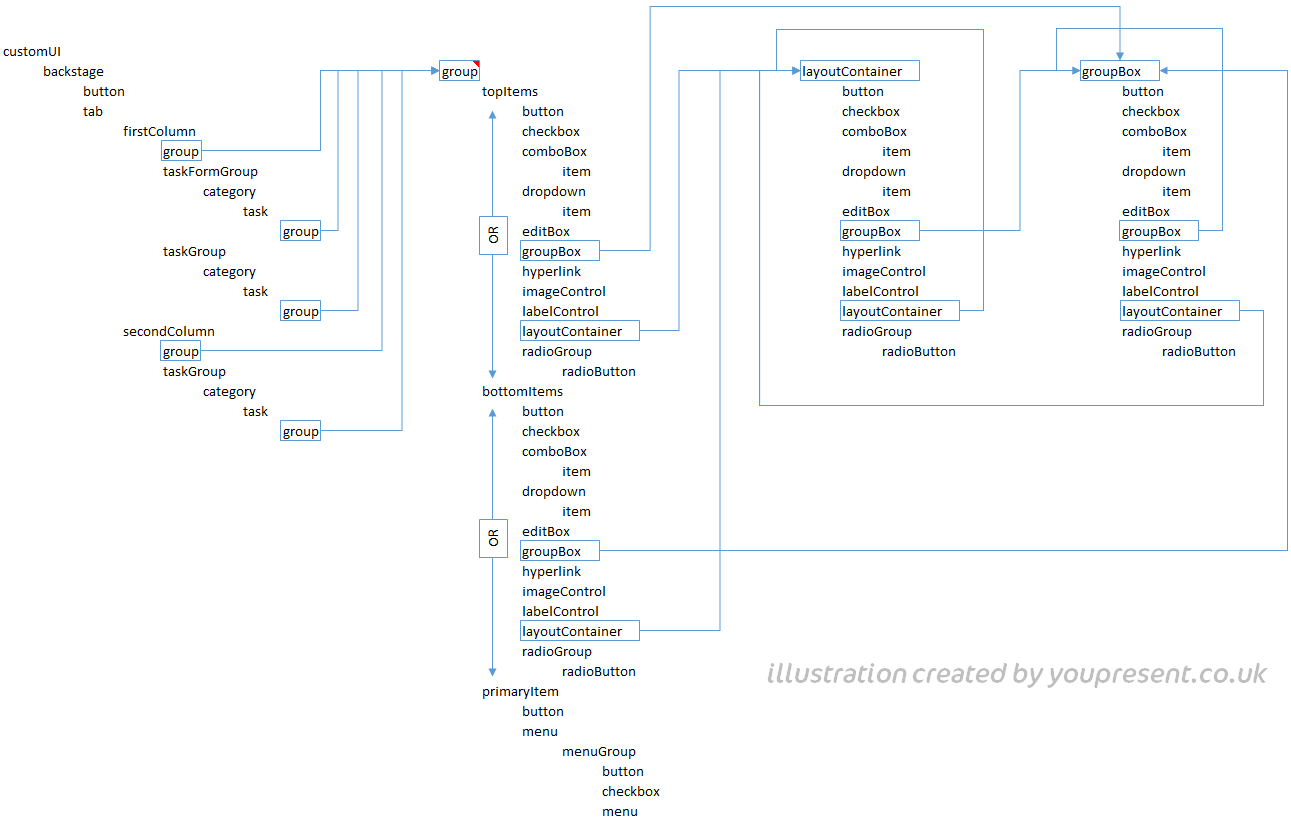
In trying to unravel the puzzle of Backstage view programming, we created the following handy view of how the various containers and controls all fit together.
You can find other useful references here: