Adding maps to PowerPoint is a straight forward task thanks to numerous sources of map templates but if you want to turn your map into a visual info graphic then a different approach is needed.
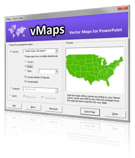
vMaps is an add-in for PowerPoint that adds a new button to the Insert tab of your ribbon in PowerPoint 2007, 2010 and 2013. From here, you can add maps of various geographical zones including World, Continent, Country, Regions, States and Counties.For maps that are made up of multiple shapes eg. a World map or a map of all the counties for a USA state, the Auto Color feature provides you with an easy way to recolor your map using data from an Excel file.There are two recoloring modes that are supported:
- Color Values from Excel : this mode uses RGB (Red, Green, Blue) values from your Excel file to color each of the map shapes defined by each row in your file.
- Color Scale : this mode uses two colors that you define to represent the minimum and maximum values in your data. vMaps then looks at the data value for each of your map shape rows and calculates a corresponding color to fill the map shape with. this is great for creating heat maps.
The video below shows how easy it is to use Auto Color in vMaps.
vMaps is available to download as a trial.