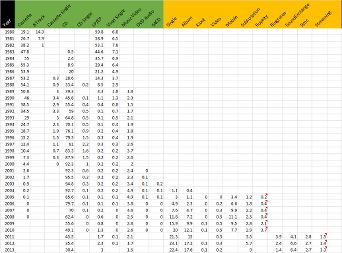
We came across a great animated GIF recently, thanks to Nolan Haims Creative, which depicted the evolution of digital music distribution from 1980 to 2010. The original article is somewhat corrupt now but can be found at Digital Music News. Here is the raw data that needed help to tell a time-based story:
And here’s the resulting animated GIF from Digital Music News:
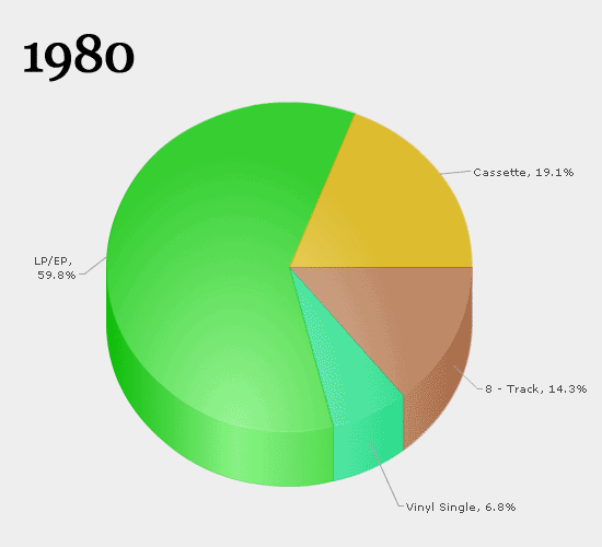
If you’re old enough to remember the 1980’s this is a great story that makes you go WOW, hasn’t the world changed!
When we looked at the GIF in detail, we noticed a couple of things that we thought could be improved based on these observations:
- the individual charts jump around a bit due to the way Excel creates callout labels
- a similar thing happens with the year text in some frames due to its use of a proportional font
- it’s quite “Excel-pie-chart-centric”
- there isn’t a visual cue to the underlying message of music
- there’s a lot of data & text in some places where the data is not so significant
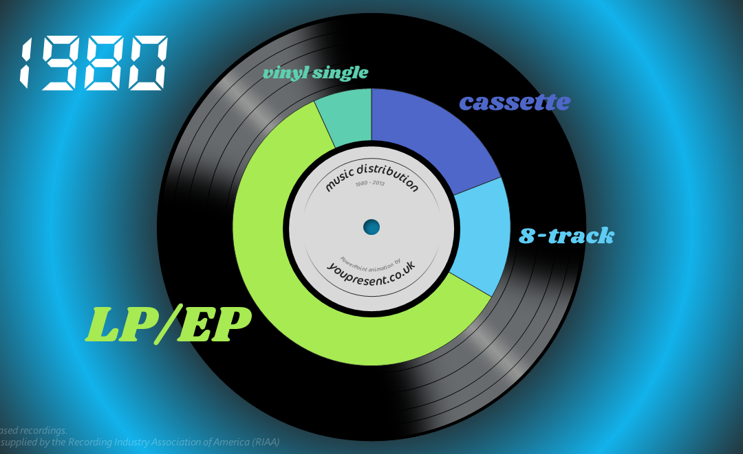
So we thought we could improve the graphics using PowerPoint. Here’s out first attempt at a revised animated GIF:
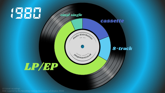
Here’s the steps we took to create this:
- First we created a custom 16:9 slide design size in PowerPoint
- We then created the slide master layout with elements such as the background style, record disc illustration and 4 placeholders for the year digits (to avoid them jumping around)
- In Excel, each row of the source data is used to create an Excel pie chart, but without any data labels
- The chart is copied to PowerPoint and the data labels (name only, not value) are created manually in a the same colour as the pie segment and the font is sized according to the percentage of the segment
- The date is set up and all values less than 1% are grouped together as “other” and called out separately to avoid overloading the charts
- We then repeated steps 3,4,5 for the other 33 slides and also added a backward counter from 2013 to 1980 (another 34 slides) to indicate that the animation is restarting
- The slide transition time is set to a 200ms cut effect
- The whole presentation is exported as an animated GIF using our PPT2GIF add-in for PowerPoint
Now everything has its own place and is consistent across the whole animation so the only elements that move are the ones that help tell the story. But it’s still a little bit jerky and the GIF file is a pretty hefty 5MB in size.
PowerPoint Morph
Morph is a relatively new transition in PowerPoint that’s available to Office 365 subscribers. It makes cross-slide transitions really smooth when you have similar content on consecutive slides. All you have to do is take a copy of the slide and move things around on the pasted duplicate. PowerPoint takes care of the rest. We then exported this to video and then converted the MP4 file to an animated GIFa using a third party video converter tool. This created a much better GIF but the file size was huge. So huge in fact that we didn’t want to kill your web browser by including it in this page.
Music
But, and this is the big one, we’re telling a story about music, so we really should include some music. Given GIF animations don’t support audio, it makes more sense in this project to create a video. Here it is, complete with a custom synchronised audio track, and as you can see, the story is much easier to follow (compared to GIF) due to the smooth morph transitions between slides.