Org charts are often painful to create.
Very painful.
No matter how clever software gets and that could be PowerPoint or any number of add-ins, there is always a boss somewhere that wants something different.
Here at i-present, we always create our org charts for clients 100% manually but it’s easy for the folks who spend their lives living and breathing PowerPoint.
There are several main challenges when creating org charts manually:
In the first part of this article series, we’re going to share a great tip to address the first of these challenges.
Connectors
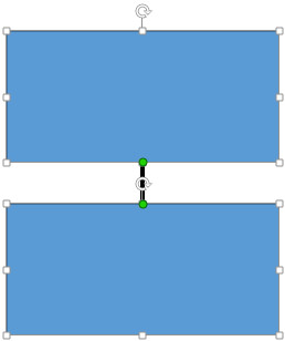
Why do we care about connectors? Well, if we don’t use connector lines to join one shape to another, when we move one or more shapes, the line will stay where it is:

two rectangles with an unconnected line between them

move one rectangle and the line stays where it is
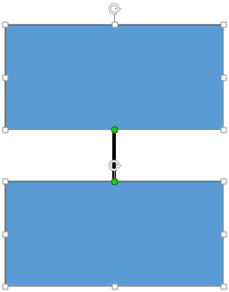
Now, if we connect the line to the connection points in the middle of the rectangle sides (indicated by the green dots in PowerPoint 2013), the line will extend when one of the shapes is moved:
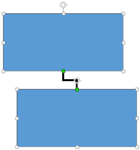
We can also use elbow connectors to join off-centered rectangles:
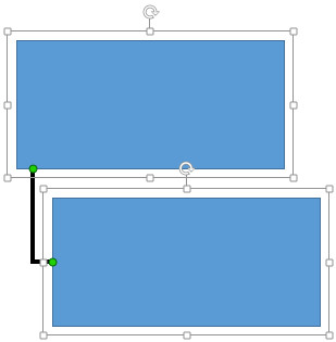
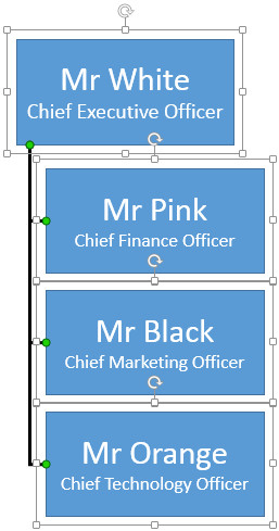
So far so good. This is fine if you’re creating a simple org chart but once you start having to squeeze more into a smaller space, you quirte often find yourself needing to join managers and subordinates closer together like this:
The default rectangle that is provided in the PowerPoint shape library is a bit limited for org charts. Why?
A rectangle is defined by it’s 4 corners but the PowerPoint auto shape also has special invisible connection points in the centre of it’s 4 sides.
So how did we make the above work?
The trick is to create your own org chart shape from a number of other shapes and then group it together. In the example above, the group for each “rectangle” is actually made up of a set of rectangles inside the perimeter of the larger main rectangle. To make things clearer, we’ve sent the large blue rectangle to the back layer so you can see the perimeter rectangles around the perimeter (coloured in red for clarity but would normally not be filled and have no line):
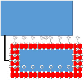
So when the shapes are grouped, we end up with a rectangle that appears to have many more connection points than a standard rectangle, the black lines connecting to the main larger blue rectangle and the red ones connecting to the smaller set of perimeter rectangles:
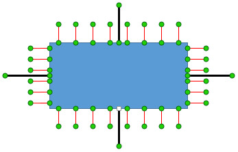
This group now forms part of your new library of org chart shapes and you can now duplicate as many times as you need and connect them together to make org charts which represent the real world:
The concept of a “library group” can be taken further by adding separate shapes within the main outer rectangle which has the benefit of making it easier for administrators to maintain the finished org chart:

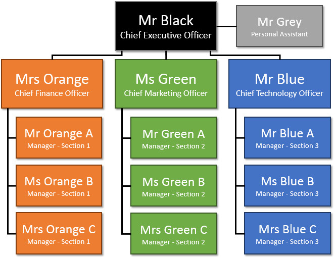
So, putting it all together, creating org charts no longer needs to be a headache. It just takes a little planning to creature the right library groups as required by your particular organisation:
Hi Jamie,
This is really awesome! Very good trick and one of my favorite tricks for PowerPoint. I was personally experiencing these problems you mentioned in the article while creating Org Charts even for our PowerPoint templates and this should have save a lot of time and effort aligning the connectors.
Look forward to read more useful tips and tricks.
Julian @ SlideModel.com
Thanks for the tips! I have also found a website that shows how to make an org chart in powerpoint and it was very easy to use and took no time at all!